
![]()
Bitcoin Symbol and Logo Origins
Table of Contents
Bitcoin Logo Construction Animation
![]()
Introduction
The first Bitcoin B symbol ( released February 2010 ) was originally created in Paint Shop Pro 7 over the course of a chat between me, (2), (3), and Sirius-m.
Sirius-m ( Martti Malmi ) was one of the earliest guys to help us during the execution phase.
I pushed (2) to use him to set up and look after the message board around late 2009 / early 2010.
- and Sirius-m were chatting back and forth about improving the Bitcoin project logo and symbol.
I said, "The glyphs used in the TrueType-Fonts were usually created using certain angles, lengths, radii and sizes so that each character can remain similar to one another. Huge globally-recognised companies have logos made that conform to a set of instructions that allow the logo to be duplicated by anyone. This allows them to use the identical logo on many different media - from television advertisements, to websites, to print magazines, to t-shirts, to vinyl stickers on vehicles. We need our symbol and logo to be made in a similar fashion."
"How the [redacted] do we do that ?" (2) said. "Making a logo as a set of instructions ? I don't know the first thing about doing that."
I told him I'd give it a go.
The idea was to make a symbol that could be accurately duplicated by others by using concise sizes and ratios.
It would then be possible for folks to recreate the same symbol and use it as a logo and a currency symbol on any type of media they wanted.
I powered up Paint Shop Pro 7 and begun.
It took quite a bit of effort to make the whole design work together.
There were many mis-steps and deletions and restarts.
- used the instructions and created the B symbol that's on the Bitcoin logo released February 2010.
He'd played around with the instructions a wee bit and ended up making the angled cut on the lower horizontal bar half the size it was supposed to be.
The vertical bars were also mis-aligned, however I'm unsure whether that was due to an error in the instructions or (2) just stuffing about.
Those hole shapes were made from a rectangle on the left, a smaller circle to the right of it and the upper curve made by using a circle the size of the B shape that curved between the top of the rectangle down to the top of the smaller circle.
The large circle was then cropped and the rectangle/circle/cropped-large-circle was cut horizontally to make up the upper portion of the hole.
It was then duplicated, mirrored vertically ( along the horizontal plane ) and combined with the upper hole shape.
These were then used to create the top hole shape and the right-hand-side B bumps.
Due to the instructions for the hole shapes not being as specific and exact as we wanted, those original instructions were never released.
I've recreated them from memory and may post them at some stage, however the updated version was more important.
Around mid-October 2010 I saw an opportunity to remake the Bitcoin symbol and logo again and improve upon the design.
It was approaching the 2nd anniversary of the release of the Bitcoin white paper.
I had bitboy go through the instructions until they were written clear enough for him to recreate it.
He apologised for the errors in his version because his drawing program kept snapping to grid or snapping to pixels so the actual sizes of some items were incorrect.
He'd also played around with the rounded shape to try and make it better and ended up distorting it a bit too much.
He said it took him so long to go through the instructions that he really didn't want to go through them again to fix the stuff-up and asked if he could just post my own version.
I told him that the idea was for the community to see that someone new to the community could be productive and do something very useful even if they weren't experts in the tech.
He was to post his version, even with the errors present.
I told him that most folks would never see the mistakes because the whole thing is going to be rotated onto a specific angle.
The updated instructions for the November 1st 2010 symbol/ logo were never released publicly because the instructions for generating the hole shape were just too harrowing for bitboy.
If he found it difficult, then many others would find them likewise.
They weren't the easy-to-follow instructions I had wanted after all, so I thought I'd leave it until I can figure out a better way of creating the holes.
Due to circumstances, I never had a chance to get back to the symbol/ logo again.
I'll only list the actual final instructions for duplicating the symbol - not the different attempts that were made trying to figure it out.
Further mention about the symbolism is listed at the end of the instructions.
It is assumed you will be using a drawing program that utilises Layers so that individual elements can be shown, hidden, moved, locked, unlocked, and deleted.
Make sure any "snap-to-grid" or "snap-to-pixel" has been turned off.
The shapes should snap to each other.
Instructions With Images
The Symbol Workspace
Make a grey large square about the size you want the B portion of the symbol to be.
![]()
The Two Horizontal Bars
Duplicate the grey large square and colour it blue so that you can see it clearly.
![]()
Scale the blue large square vertically by 12.5 and horizontally by 50% ( 12.5 x 4 ) ( it will now be a blue horizontal bar ).
![]()
Scale the blue horizontal bar by 112.5% ( 12.5 x 9 ).
![]()
Align the left-hand-edge of the blue horizontal bar to the left-hand-edge of the grey large square.
![]()
Align the top-edge of the blue horizontal bar to the top-edge of the grey large square.
![]()
Duplicate the blue horizontal bar colour it dark-blue.
![]()
Scale the dark-blue horizontal bar vertically by 112.5% ( 12.5 x 9 ).
![]()
Align the left-hand-edge of the dark-blue horizontal bar to the left-hand-edge of the grey large square.
![]()
Align the bottom-edge of the dark-blue horizontal bar to the bottom-edge of the grey large square.
![]()
The Single Main Vertical Bar
Make a large square that fills the space between the two blue horizontal bars and colour it light-grey.
![]()
Scale the light-grey large square horizontally by 25% ( 12.5 x 2 ) ( it will now be a light-grey vertical bar ).
![]()
Align the left-hand-edge of the light-grey vertical bar to the left-hand-edge of the grey large square.
![]()
Align the top-edge of the light-grey vertical bar to the bottom-edge of the blue horizontal bar.
![]()
Duplicate the top blue horizontal bar and colour it dark-grey.
![]()
Rotate the dark-grey horizontal bar by 90° ( it will now be a dark-grey vertical bar ).
![]()
Scale the dark-grey vertical bar horizontally by 162.5% ( 12.5 x 13 ).
![]()
Align the left-hand-edge of the dark-grey vertical bar to the right-hand-edge of the light-grey vertical bar.
![]()
Align the top-edge of the dark-grey vertical bar to the bottom-edge of the top blue horizontal bar.
![]()
Increase the height of the dark-grey vertical bar so that the bottom-edge of the the dark-grey vertical bar aligns with the top-edge of the bottom blue horizontal bar.
![]()
Make a square the width of the light-grey vertical bar and colour it black.
![]()
Scale the black square by 75% ( 12.5 x 6 ).
![]()
Make a square the width of the light-grey vertical bar and colour it dark-grey.
![]()
Scale the dark-grey square by 50% ( 12.5 x 4 ).
![]()
Make a circle the width of the black square and colour it medium-grey.
![]()
Align the medium-grey circle to the right-top-corner of the light-grey vertical bar.
![]()
Scale the black square by 50% ( 12.5 x 4 ).
![]()
Align the right-top-corner of the black square to the right-top-corner of the light-grey vertical bar.
![]()
Make a circle the width of the dark-grey square and colour it white.
![]()
Align the white circle to the right-bottom-corner of the light-grey vertical bar.
![]()
Scale the dark-grey square by 50% ( 12.5 x 4 ).
![]()
Align the right-bottom-corner of the dark-grey square to the right-bottom-corner of the light-grey vertical bar.
![]()
Use a Boolean subtract operation to cut the medium-grey circle away from the black square.
![]()
Use a Boolean subtract operation to cut the white circle away from the dark-grey square.
![]()
The Angled Cut
Duplicate the grey large square and colour it green.
![]()
Scale the green large square by 25%.
![]()
Rotate the green square clockwise by 12.5°.
![]()
Align the right-hand-edge of the green slanted square to the left-bottom-corner of the dark-blue horizontal bar.
![]()
Use a Boolean subtract operation to cut the green slanted square away from the dark-blue horizontal bar.
![]()
( When the angle is 6.25% it's called Eric because it's half-a-B ).
The Two Vertical Bars
Duplicate the top blue horizontal bar and colour it dark-blue.
![]()
Scale the dark-blue horizontal bar by 50% ( 12.5 x 4 ).
![]()
Rotate the dark-blue horizontal bar by 90° ( it will now be a dark-blue vertical bar ).
![]()
Vertically align the vertical centre of the dark-blue vertical bar with the vertical centre of the grey large square.
![]()
Duplicate the dark-blue vertical bar and colour it light-blue.
![]()
Scale the dark-blue vertical bar by 525% ( 12.5 x 42 ).
![]()
Scale the light-blue vertical bar vertically by 525% ( 12.5 x 42 ) and horizontally by 150% ( 12.5 x 12 ).
![]()
Align the top-edge of the light-blue vertical bar to the top-edge of the dark-blue vertical bar.
![]()
Align the horizontal centre of the light-blue vertical bar to the horizontal centre of the dark-blue vertical bar.
![]()
Use a Boolean subtract operation to cut the light-blue vertical bar away from the dark-blue vertical bar.
![]()
Colour the two vertical bars light-blue.
![]()
The vertical bars look a little too tall, so they must be reduced in size.
Duplicate the top blue horizontal bar and colour it green.
![]()
Scale the green horizontal bar vertically by 25% ( 12.5 x 2 ).
![]()
Align the top-edge of the green horizontal bar to the top-edge of the light-blue vertical bars making sure that the tops of both light-blue vertical bars are covered by the green horizontal bar.
![]()
Use a Boolean subtract operation to cut the green horizontal bar away from the light-blue vertical bars.
![]()
Vertically align the vertical centre of the light-blue vertical bars with the vertical centre of the grey large square.
![]()
Align the right-hand-edge of the left-most light-blue vertical bar to the right-hand-edge of the dark-grey vertical bar.
![]()
The B Bumps
The shape of the holes comes from a specific ratio between two circles.
Make a circle that fills the width of the dark-grey vertical bar and colour it light-purple.
![]()
Duplicate the light-purple circle and colour it purple.
![]()
Scale the purple circle by 125% ( 12.5 x 10 ).
![]()
Align the horizontal centre of the purple circle to the right-hand-edge of the dark-grey vertical bar.
![]()
Align the bottom-edge of the purple circle the the top-edge of the bottom dark-blue horizontal bar.
![]()
Align the vertical centre of the light-purple circle to the vertical centre of the purple circle.
![]()
Align the left-hand-edge of the light-purple circle to the right-hand-edge of the purple circle.
![]()
The hole area is now to be filled between these two circles.
The idea is to start with the right-most smaller circle and slowly increase its size while at the same time increase its width until it's the same height as the larger circle.
To help with the maximum size of these ovals, create a sizing-rectangle along the top edge of the purple circle with a width that spans the distance between the purple circle and the light-purple circle.
![]()
Start by duplicating the light-purple circle and colour it dark-purple.
![]()
Each dark-purple circle is increased by the previous dark-purple circle horizontally by 102.38% ( 100% + ( 100 / 42 ) ) and vertically by 101%.
Make enough intermediate dark-purple circles until the height is the same as the first larger purple circle.
![]()
Delete the sizing-rectangle.
![]()
On the Layers panel, Lock the grey large square, the light-blue vertical bars, the small light-purple circle, and any other shape so that you don't mistakingly select it.
![]()
Group align-right all dark-purple circles.
![]()
Group align-vertical-centre all dark-purple circles.
![]()
Align the right-hand-edge of these grouped dark-purple circles to the right-hand-edge of the smaller light-purple circle.
![]()
On the Layers panel, Unlock the small light-purple circle.
Merge the larger purple circle, the smaller light-purple circle and these intermediate dark-purple circles together.
![]()
On the Layers panel, Unlock the grey large square, the light-blue vertical bars, and any other shapes you previously locked.
Colour the hole shape purple if it has changed during the merging.
![]()
Use a tool to delete the anchor points that are dipping into the purple hole shape.
![]()
![]()
Duplicate the dark-grey vertical bar ( make sure to paste-in-place or move the duplicate back over to the original location ).
![]()
Use a Boolean subtract operation to cut the duplicate dark-grey vertical bar away from the purple hole shape.
![]()
Duplicate the purple hole shape and colour it pink.
![]()
Scale the pink hole shape vertically by 175% ( 12.5 x 14 ) and horizontally by 150% ( 12.5 x 12 ).
![]()
Align the top-edge of the pink hole shape with the top of the large-grey square.
![]()
Align the left-hand-edge of the pink hole shape with the right-hand-edge of the dark-grey vertical bar.
![]()
Duplicate the pink hole shape and colour it green.
![]()
Scale the green hole shape by 112.5 ( 12.5 x 9 ).
![]()
Align the bottom-edge of the green hole shape with the bottom of the large-grey square.
![]()
Align the left-hand-edge of the green hole shape with the right-hand-edge of the dark-grey vertical bar.
![]()
On the Layers panel, drag the purple hole shape above the green hole shape so that it appears onscreen again.
![]()
Duplicate the green hole shape and colour it red.
![]()
Scale the red hole shape by 50% ( 12.5 x 4 ).
![]()
Align the top-edge of the red hole shape to the bottom-edge of the top blue horizontal bar.
![]()
Scale the red hole shape vertically by 93.75% ( 12.5 x 7 + ( 12.5 / 2 ) ).
![]()
Align the left-hand-edge of the red hole shape to the right-hand-edge of the dark-grey vertical bar.
![]()
The Orange Circle
Only follow this step if you want to change the Bitcoin symbol into the Bitcoin logo.
Duplicate the dark-grey vertical bar and colour it yellow.
![]()
Align the left-hand-edge of the yellow vertical bar with the right-hand-edge of the dark-grey vertical bar.
![]()
Make a circle that fills the width from the left-hand-side of the dark-grey vertical bar to the right-hand-side of the yellow vertical bar combined.
![]()
Delete the yellow vertical bar.
![]()
Colour the circle orange.
![]()
It is made from a CMYK of:
- C: 0%, M: 50%, Y: 100%, K: 0%
For RGB drawing programs you can use
- Red: 247, Green: 148, Blue: 29
- (1.0) Red: 0.97, Green: 0.58, Blue: 0.10)
- (Hex) f7941d
Align the centre of the orange circle with the centre of the grey large square.
![]()
Scale the orange circle by 525% ( 12.5 x 42 ).
![]()
On the Layers panel, drag the orange circle below the all of the other shapes so that they all appear onscreen again.
![]()
On the Layers panel, Lock the orange circle so that you don't mistakingly select it.
Finishing Off
On the Layers panel, Unlock any shape that you'd locked earlier ( except the orange circle if added ).
Delete the large grey square.
![]()
Delete the light-grey vertical bar.
![]()
Use a Boolean merge operation to join the dark-grey vertical bar, the blue horizontal bars, the light-blue vertical bars, the green hole shape, the pink hole shape and the two curved corners.
![]()
![]()
Colour the B shape black.
![]()
If the red hole shape isn't showing then on the Layers panel, drag the red hole shape above the black B shape so that it appears onscreen again.
![]()
Use a Boolean subtract operation to cut the red hole shape away from the black B shape.
![]()
If the purple hole shape isn't showing then on the Layers panel, drag the purple hole shape above the black B shape so that it appears onscreen again.
![]()
Use a Boolean subtract operation to cut the purple hole shape away from the black B shape.
![]()
Tidy up the curves of the B shape if necessary to make the transition between the various radii look smoother.
Remove any residue left over from the purple hole ( the removal of anchors may have created an extra filled arc shape ).
If you're making the Bitcoin logo then
- Colour the B shape white.
![]()
- Rotate the B shape clockwise by 13.88° ( rounded up to 14° depending upon your drawing program ).
![]()
Completed Bitcoin Logo
A tif file stores the image with the correct CMYK values
![]()
Completed Bitcoin Symbol
![]()
Bitcoin Logo SVG file
![]()
Bitcoin Symbol SVG file
![]()
Bitcoin Logo Construction Animation
Symbolism
Quite a bit of thought went into this symbol and logo.
Covered In Bees
The entire Bitcoin symbol and logo is covered in bees .
The number "8" is used as a numeric replacement for "B" ( for Block ).
12.5% is an eighth and represents the number "8" and the letter "B" for a block.
Each time a new shape is added to the image, it's another block is being added.
The many blocks throughout the Bitcoin symbol/logo shows that it is actually a blockchain twisted up like a quantum string.
Each time the added shape is resized it indicates that the blocks are changing sizes due to what's needed by the system.
With all of the added shapes being used throughout the Bitcoin symbol/logo in all of its corners, it represents the distribution of the blockchain data across the planet.
Why The Two Vertical Bars ?
Practically all fonts display a single vertical bar for "$" as going straight through the symbol from top to bottom.
The early fonts ( 1970's and 80's) did this due to the low resolution of computer screens when these fonts were first created.
Later fonts copied the same style even though screen resolutions were no-longer such a problem.
The two vertical bars comes from how the "$" symbol was usually drawn in the Disney Scrooge McDuck comic books.
Why do the vertical bars only appear above and below the "B" ?
I wanted the symbol to represent the previous global currency standard - the US dollar - being supplanted by Bitcoin.
This meant having the "B" appear to have been stamped over the top of the "$".
I always liked the word Trebuchet and using them in Microsoft's Age of Empires game to destroy the incumbents in their castles.
And the font is quite similar to other website-friendly fonts like Arial and Verdana.
The Trebuchet font displays the "$" symbol with only bars above and below the "S".
The vertical bars are made a wee bit smaller than the other line thicknesses in the "B" symbol to show that they're from the previous "$" symbol and figuratively behind Bitcoin.
In other words:
The two vertical lines are slightly thinner than the other lines to show that those lines are not actually from the Bitcoin symbol, but from the $ symbol that's been "Stamped" into the ground by Bitcoin.
( imagine there's actually a $ behind the Bitcoin symbol that's been crushed )
Why An Orange Circle ?
I needed the colour to be usable on both websites and print media.
Print media includes marketing paraphernalia, for example caps and t-shirts with the Bitcoin logo.
It also includes having a "Bitcoin accepted here" sticker to go alongside the VISA and Mastercard stickers on merchant shop windows and counters.
It had to look as valid as those creditcard logos but also stand out.
When someone is walking across a street towards a few food shops ( cafes/ Chinese/ Thai/ etc ) their sub-conscious would be choosing which shop to go into based upon how they can pay for the food.
Many small merchants have very low margins and cannot afford the costs involved with leasing the EFTPOS ( electronic funds transfer at point-of-sale ) or creditcard processing equipment and are therefore cash only.
As you cross the street your eyes scan for the known payment logos and, if none are present on the window nearby the doorway you assume it's cash-only and choose to go next door.
If you were going to pay by cash your sub-conscious wouldn't be scanning for the payment logos.
Your sub-conscious would be telling you "You can buy here with cash", "You can buy here with creditcard and cash", and so on, in the order that it notices or doesn't notice relevant logos.
I wanted folks sub-conscious to be telling them "you can buy here with Bitcoin" before they saw the VISA and mastercard logos.
If folks glanced at a website or clicked on its "View Shopping Cart" button their peripheral vision must notice the Bitcoin symbol first.
The Bitcoin logo must stand out against all others.
As a person crosses the street they would first notice the Bitcoin logo and their sub-conscious tells them "Oh! I can buy using Bitcoin there".
As they cross the street further they'll notice the Mastercard logo ( it stands out better than the VISA logo ) and their sub-conscious will tell them "I can buy using Bitcoin there, and Mastercard".
Then the VISA logo will be noticed and their sub-conscious to tell them "I can buy using Bitcoin there, and Mastercard, and VISA".
What's happening is the equivalent of Neuro-linguistic programming but for symbols.
A kind of Neuro-symbolic programming.
Based upon the shape and colour for the Bitcoin logo I should be able to program that symbol and logo into folks minds without them even being aware of it.
They also won't be able to stop the programming from happening.
Even for folks who have never heard of Bitcoin or have never owned any bitcoin, they will all end up having their brain tell them that the number one form of payment at this merchant store is this thing called Bitcoin.
If they walk down a commercial street and every second store has a sticker on the window with the Bitcoin logo upon it then their peripheral vision will make their sub-conscious continuously store the information "You can buy with Bitcoin here, and here, and over there, and with them, ..."
Their brains would have the phrase Pay-with-Bitcoin-first and the Bitcoin symbol and logo locked inside it forever.
So the updated Bitcoin symbol and its logo has to stand out better than the logos of these mega-sized companies and the budgets and expertise they had brought forth when designing their logos.
No pressure, right ?
So back to the colours for websites and print media.
This meant I had to use CMYK values to select the specific colour.
CMYK stands for Cyan, Magenta, Yellow and Key ( black ).
These are colours used within the printing industry.
I decided to focus on using combinations of 0, 50, and 100 so that the colour could be easy to memorise so that it would become the one international symbol that every human being would be able to recognise and reproduce.
The CMYK of 0,50,100,0 ( an orange colour ) looked best compared with the other possible colours.
Even though some of the other colours were very close contenders, the orange colour stood out the most if used as the primary influence to get folks attention.
It was also very close to the typical safety orange colour many folks are used to seeing.
That particular orange was chosen for the safety orange colour because it stood out compared to other colurs.
This would make the Bitcoin logo incredibly visible from a distance wherever it's displayed.
It is made from a CMYK of:
- C: 0%, M: 50%, Y: 100%, K: 0%
For RGB drawing programs you can use
- Red: 247, Green: 148, Blue: 29
- (1.0) Red: 0.97, Green: 0.58, Blue: 0.10)
- (Hex) f7941d
The closest match for this colour as a paint appears to be:
- RAL 1033 Dahlia Yellow
- Pantone Solid Coated 2012 C
Many of the lower-quality drawing apps use 32-bit values for their colours ( 8 bits per RBG colour channel ).
High quality apps like Adobe Photoshop use 24 or 32 bits per RGB colour channel.
That's why their gradients have always been superior to the other drawing apps.
It's also why their memory foot-print has always been so much higher.
i.e.
A pixel in an image may be RGBA 32-bit value.
Inside a lower-quality app that pixel would take up 32 bits ( R:8, G:8, B:8, A:8 ).
Inside the higher-quality app that pixel would take up 128 bits ( R:32, G:32, B:32, A:32 ).
So Photoshop would be able to get closer to the CMYK value in RGB format than these other apps which use 32 bits to represent a 32-bit pixel.
Only the TIFF formatted image would show the colours correctly.
When it came to choosing which shape surrounds the Bitcoin symbol, I looked at how different shapes affect folks.
A square or a star shape would get a viewer's attention better because the sharp angles make their peripheral vision tell them to look at it.
We're pretty much hard-wired to turn towards any movement in our periphery.
It would come from the hunter-gatherer days when we needed to be able to quickly notice prey to hunt or predators hunting us.
As a person moves, the sharp angles end up making the peripheral send movement signals to the brain, alerting a person to look in its direction.
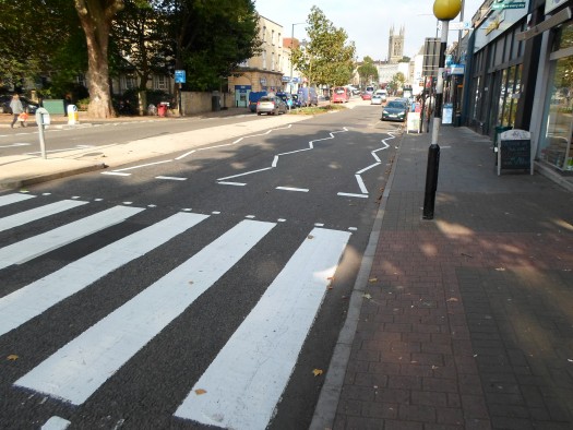
The same thing happens due to those zig-zag pedestrian angled lines that are painted onto the roads in some countries.
However it'd be an annoyance to alert a person continuously to Bitcoin.
A circular shape is more warm and friendly.
The shape is continuous, endless, forever - just like Bitcoin.
Place two of them side-by-side and you get the symbol for infinity, which also happens if you place an 8 on its side, where the number 8 is a replacement for the B symbol.
Isaac Asimov's Foundation saga influenced the idea of using a form of PsychoHistoric Game Theory to control the actors in the game.
There were two foundations with the Second Foundation at Star's End.
In the Second Foundation book, when the true controllers of the game were actively being hunted, one of the characters thought at Star's End meant that the Second Foundationers could be on Terminus itself ( Terminus being the First Foundation home planet ).
She thought they'd be on Terminus because she looked at the galaxy as a disc, a circle, and Terminus was a planet at the very edge of the galaxy.
And if you follow a circle all the way around its circumference, you end up back where you started from - on Terminus.
Of course, she was wrong because the Foundations were not a physical construct, but a social construct.
The galaxy is a spiral and the far end of a spiral is its centre.
In late 2010 we were being actively hunted.
I thought it'd be fitting to include the idea that all of these hunters were looking in all the wrong places due to their assumptions that the galaxy was a flat circle - that the creators of the Bitcoin technology were mathematicians, cryptographers, economists, academics.
It's the traditional shape of a coin and looks like an abstraction of the Bitcoin symbol etched onto a coin.
Far better to have the colour alert the person to Bitcoin rather than the shape.
And so a simple, plain orange circle was the chosen shape surrounding the Bitcoin symbol.
Why 12.5° Angled Cut ?
This is linked to the chosen port number for the Bitcoin network.
The port number for Bitcoin was chosen to be 8333.
The 8 was chosen because it's the number that looked most like a "B" - for Bitcoin and Block.
If you offset four "B"s like offsetting four playing cards, "BBBB" looks like "8333".
It also represents a Chain of Blocks.
100 divided by 8 equals 12.5.
That angle is a hidden "B" representing the link between Bitcoin and Blocks - the two go together always.
The angle on the February 2010 Bitcoin logo was 6.25, which I called Eric, because any size or angle that's 6.25 = ( 12.5 / 2 ) which is half-a-bee.
The curved corners were to make the two left-hand-side bars look like a serif font.
Why rotate the B shape by 14° on the logo ?
14° came about by adding an infinite number of B's together by dividing the previous value by 10.
12.5 + 1.25 + 0.125 + 0.0125 + 0.00125 + 0.000125 + 0.0000125 + 0.00000125 + 0.000000125 + 0.0000000125 + 0.00000000125 + 0.000000000125 ...
This comes to about 13.888 repeating.
When using a drawing program that rounds the rotation angle to the closest full percent, the angle becomes 14°.
The angle represents the blockchain progressing into the future forever.
Why is the size of the orange circle scaled by 525% on the logo ?
525% is 12.5 x 42.
This technology is supposed to be the answer to the ultimate question of life, the universe, and everything.
That would mean there should be a 42 in the symbol somewhere.
The height of the two vertical bars also includes 42 in its scaling ratio.
Why The Multiple Ovals For The Hole Shapes ?
It is representative of the proof-of-work effort required to embed each block into a chain.
Each oval shape is a block header and is directly derived from the previous oval shape.
It's not possible to extract one oval shape and place it somewhere else, without redoing all of the previous size-scaling work again.
And if the size-scaling work was redone then it would be obvious to all that the oval shape wasn't correct or didn't have the required amount of proof-of-work behind it.
Summary
The next time you hear the Safety Dance song, make sure to read its lyrics with the thought of Bitcoin in mind.
It's pole to pole without any control.
Bitcoin Logo Construction Animation
Cheers,
Phil
(Scronty)